
For someone who loves language and typography, this week’s prompt touches on a topic I’ve always found to be interesting.Understanding a language starts with the alphabet. And the interdependency of language and communication is pretty obvious – when you travel. Any form of communication, will decide, if you will have your next meal, travel to your next destination, or understand what’s happening around. Some signs are clear – even if you don’t understand the alphabets. Some not so much. Let’s take a look at some interesting shots around the globe, and interpret what’s vague and what’s not. Make a story – perhaps?

This poster wall screams for attention. There’s so much happening. Background posters blend into oblivion with the ‘Resistance Movement’ taking centre stage. But then, I’m not sure why would anyone want to paste a salon ad in the same space.
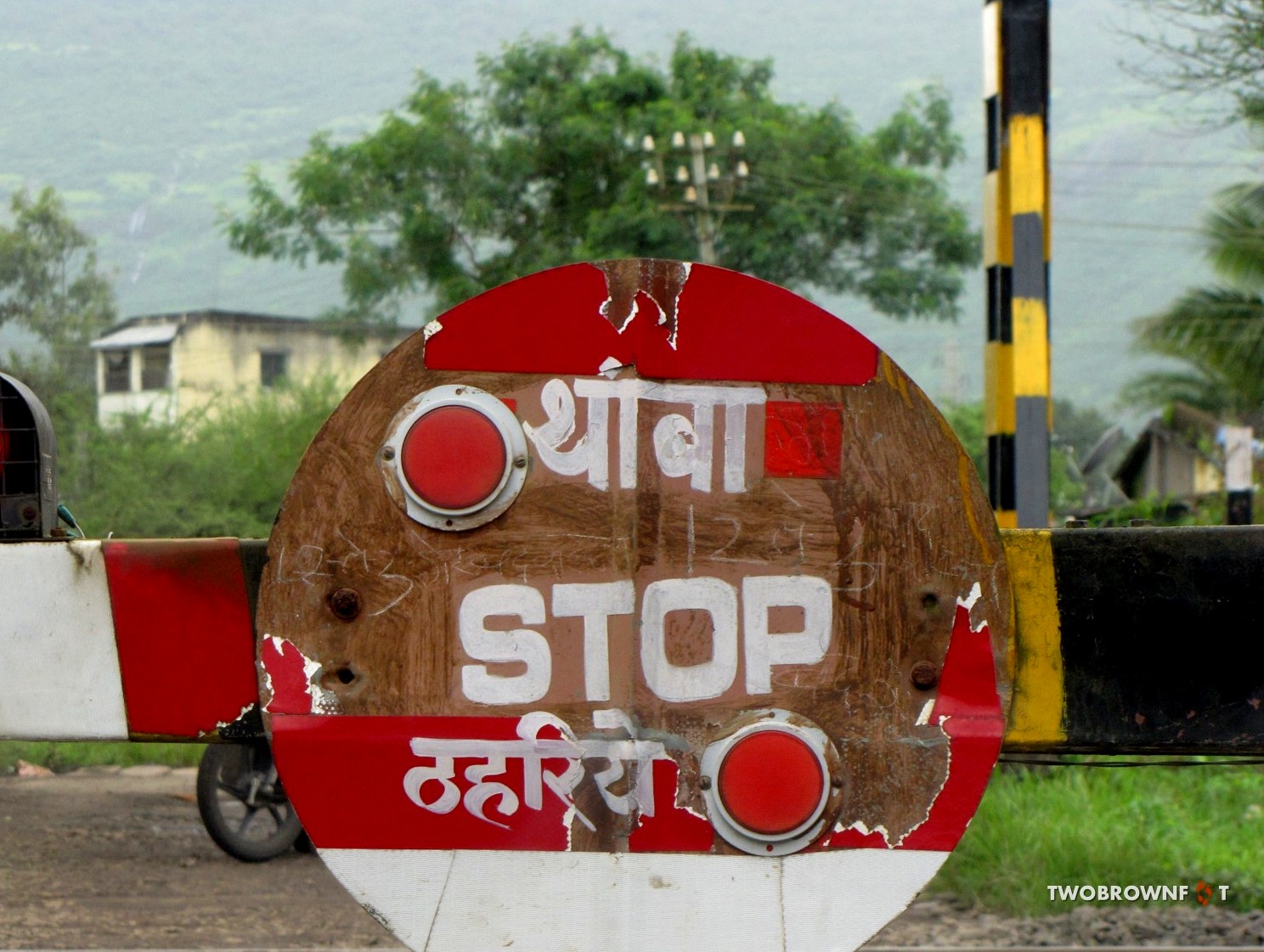
Sometimes, you might need three languages to communicate a single message.

And sometimes, one would do. Even if it doesn’t mean much.

If you’re hungry – read the board. When in doubt – look closely at the accompanying photographs.

Typography can look pretty. Especially, if it’s standing.

Words mean little when emotions run high.

Stringing many words together might not always make perfect sense.

And words that don’t make sense, might make a lot of sense.

Foreign Typography is really pretty.
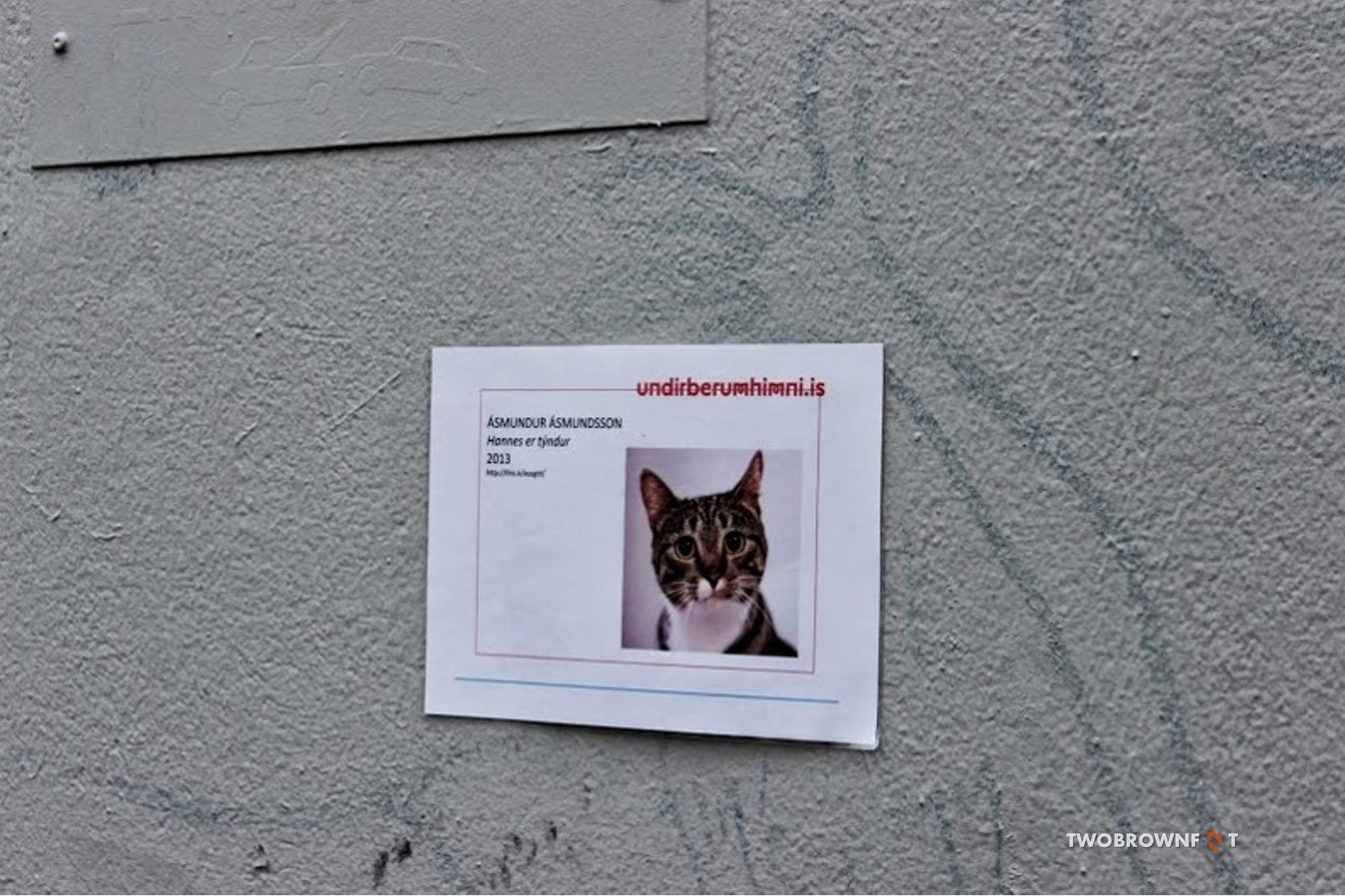
Someone’s lost a kitty?

Great minds think alike – I too explored the intricacies of language this week. Loved your post and esp like the Heart photo. Nicely done.
I agree Tina! 🙂 Thanks a bunch!
Great collection for the theme!
Thanks Kat! 🙂
Thats a great set of pictures! Loved the chappals! 🙂
Thanks! So do I! And ‘Ice Age’ is one of my favourite animated films. 🙂
Very well documented! Love the idea to present the alphabets around the world!
Thanks Indah! Hope you’re settling well. It’s been a while since I’ve heard from you. 🙂
Enjoyed your blog, as always! Thank you for all your stories.
Thanks a bunch! Your comment really made my day! 🙂 I truly enjoy your photography and the little details that you weave into your post.
Thank you for your kind words!
🙂